By Social Design Purposeful design for people and planet

By Social Design

Purposeful design for people and planet

Latest Articles

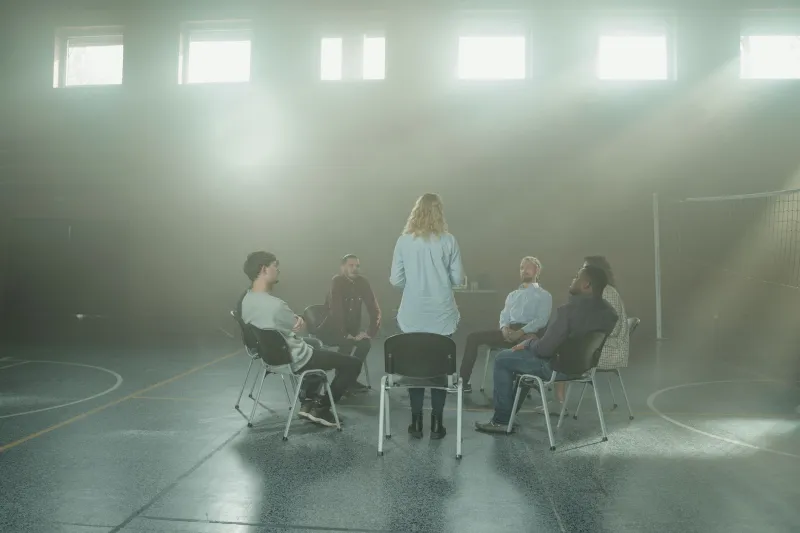
The Room Is the First Facilitator: Designing Consultation Spaces That Say 'Stay'
Community & Co-Design

The Room Is the First Facilitator: Designing Consultation Spaces That Say 'Stay'

Before anyone introduces themselves or opens a flipchart, the room has already made a speech. Here's how UK charities can design consultation spaces that feel hosted rather than processed — from chair arrangements and signage to the person at the door.

The Paperwork Is the Welcome: Rethinking Governance Documents as Brand Work
Brand Strategy

The Paperwork Is the Welcome: Rethinking Governance Documents as Brand Work

Charity brand work often stops at the website, the campaign, the fundraising appeal. But for trustees and new board members, the first real experience of your organisation is a PDF. This piece looks at how small UK charities can make governance papers feel as thoughtful and human as the work they describe.

Before the First Hello: A Dignity Audit for Charity Paperwork
Purposeful Design

Before the First Hello: A Dignity Audit for Charity Paperwork

Referral forms and consent sheets are often the first real conversation someone has with a charity — and the point where they quietly give up. This is a practical, dignity-first audit for small UK charities: fewer questions, plainer words, accessible formats, and a simple way to test whether your paperwork welcomes people in or wears them down.

Borrowed Attention: How Charity Campaigns Can Be Good Guests in Public Space
Purposeful Design

Borrowed Attention: How Charity Campaigns Can Be Good Guests in Public Space

Most people meet a charity campaign while waiting for a bus, a prescription, or a child to come out of storytime. This is a practical guide to designing for borrowed attention — without guilt, clutter, or a QR code that asks too much.

One Brand, Two Tongues: The Bilingual Audit Your Charity Actually Needs
Brand Strategy

One Brand, Two Tongues: The Bilingual Audit Your Charity Actually Needs

Plenty of UK charities translate their materials. Far fewer design them as genuinely bilingual brands. Here is a practical, slightly opinionated audit for small teams who want Welsh and community languages to carry equal weight — not sit politely in a subtitle.

Built for the Group Chat: Brand Assets That Survive Being Forwarded
Brand Strategy

Built for the Group Chat: Brand Assets That Survive Being Forwarded

For small UK charities, the most important brand touchpoint is often a forwarded screenshot, a cropped flyer photo or a tiny group-chat avatar. Here’s a practical way to test whether your identity still works when it’s been compressed, copied and captioned by someone else.

The Kindest Button on Your Website: Designing Feedback People Actually Trust
Brand Strategy

The Kindest Button on Your Website: Designing Feedback People Actually Trust

A complaints form is rarely the flashiest part of a charity brand, but it might be the most revealing. This piece looks at how UK charities can design feedback journeys that feel human, accessible and honest — from the words on the button to the follow-up email that proves someone listened.

The First Ninety Seconds: Designing a Charity Phone Line That Doesn't Abandon People
Purposeful Design

The First Ninety Seconds: Designing a Charity Phone Line That Doesn't Abandon People

Most UK charities pour care into the website and then leave the phone menu to chance. But the first ninety seconds of a call are a design object — one that can calm someone down or quietly tell them they don't matter. Here's how small teams can make that moment clearer, kinder and more dignified without a big budget.

Your Gift Aid Email Is a Brand Asset (Sorry)
Brand Strategy

Your Gift Aid Email Is a Brand Asset (Sorry)

Most UK charities polish the homepage and then let the receipt do the emotional work in a grey system font. This is a plain-English case for designing the boring moments — Gift Aid confirmations, Direct Debit notes, refund replies and complaint acknowledgements — with the same care as everything else your supporters see.

Two Logos, One Waiting Room: Branding a Charity Merger Without Erasing the People In It
Brand Strategy

Two Logos, One Waiting Room: Branding a Charity Merger Without Erasing the People In It

Most merger brand guidance arrives after the legal work is done — roughly a fortnight before someone has to tell four hundred service users the drop-in has a new name. Here's how to audit both brands, decide what actually survives, and design a transition that reassures rather than erases.

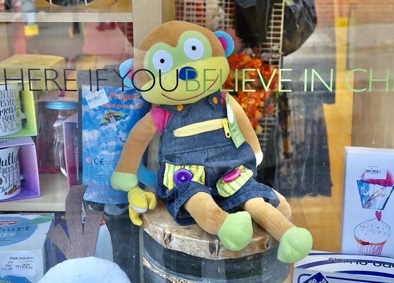
Stop Apologising in the Window: Charity Retail and the Art of Looking Like You Belong on the High Street
Purposeful Design

Stop Apologising in the Window: Charity Retail and the Art of Looking Like You Belong on the High Street

Your shop window is one of the only places where purpose, place and brand meet a passer-by without a screen in between. Which is why a laminated A4 notice, three sun-faded posters and a biro scrawl about buggies are doing more damage than you think.

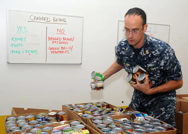
Nobody Wants to Be a Poster Child: A Dignity Brief for UK Food Banks
Purposeful Design

Nobody Wants to Be a Poster Child: A Dignity Brief for UK Food Banks

The queue, the signage, the script, the room where the conversation happens — none of it is neutral. A practical dignity brief for food banks, and for the designers and volunteers who hold the pen.

Paper Beats Ping: Designing Local Information for People Who Never Log On
Community & Co-Design

Paper Beats Ping: Designing Local Information for People Who Never Log On

Digital-first is a decision, not a fact of life — and it quietly decides who gets to hear about the coffee morning. A practical look at noticeboards, leaflets, phone trees and the other offline surfaces UK community groups keep forgetting to design.

Cheap Is Not a Personality: The Branding Trap That Makes Good Charities Look Uncertain
Brand Strategy

Cheap Is Not a Personality: The Branding Trap That Makes Good Charities Look Uncertain

Small charities are often nudged towards beige, apologetic communications to prove they are careful with money. But austerity branding has a quiet cost: it can make vital services harder to find, harder to trust, and harder to use. Here is the case for purposeful credibility without corporate gloss.

The Lanyard Test: Designing a Volunteer's First Hour So They Actually Come Back
Community & Co-Design

The Lanyard Test: Designing a Volunteer's First Hour So They Actually Come Back

Volunteer onboarding is not just admin. It is a design problem with a front door, a welcome, a threshold, and a follow-up. Get the first hour right and people are far more likely to return for the second. Here is a practical guide for UK charities, from the enquiry form to the thank-you.

Left Outside the Donate Button: What Small Charities Owe Disabled Supporters
Purposeful Design

Left Outside the Donate Button: What Small Charities Owe Disabled Supporters

Accessibility gaps rarely announce themselves. They pile up quietly in uncaptioned videos, scanned PDFs, 28-pixel buttons and forms that time out too fast. Here's how small UK charities can start paying that debt down in 90 days — treating access as a relationship rather than a compliance box.

Make Yourself Unnecessary: Handing Over a Brand That Outlives the Studio
Brand Strategy

Make Yourself Unnecessary: Handing Over a Brand That Outlives the Studio

A brand that only holds together while the studio is still in the room isn't finished — it's on life support. On living guidelines, trustee inductions, internal champions and the cheap, unglamorous habits that keep a charity's identity coherent long after launch day.

Five Grand, Honestly Spent: What a Small UK Charity Really Gets for a £5,000 Design Budget
Brand Strategy

Five Grand, Honestly Spent: What a Small UK Charity Really Gets for a £5,000 Design Budget

Five thousand pounds is a real budget — it's just a narrow one, and knowing which rung of the ladder to climb first is the difference between design that works and design that sits in a folder. Here's a plain-English breakdown of what things actually cost, where DIY is fine, and what to sort before your trustees sign it off.

Lighter, Slower, Honest: What Low-Carbon Design Looks Like When You Actually Mean It
Purposeful Design

Lighter, Slower, Honest: What Low-Carbon Design Looks Like When You Actually Mean It

Sustainability in design is not a colour scheme. It's a series of small, unglamorous decisions — about image weight, print runs, hosting and restraint — and most of them are cheaper than the alternative. A constructive look at what low-carbon brand work means in a UK charity context, plus an audit you can start on Monday.

Who's Holding the Pen? What UK Community Projects Still Get Wrong About Co-Design
Community & Co-Design

Who's Holding the Pen? What UK Community Projects Still Get Wrong About Co-Design

Too many co-design processes are workshops where the decisions were made months earlier. If you're a UK charity or community project wrestling with what genuine collaboration looks like — and what it costs — this is for you.