Borrowed Attention: How Charity Campaigns Can Be Good Guests in Public Space
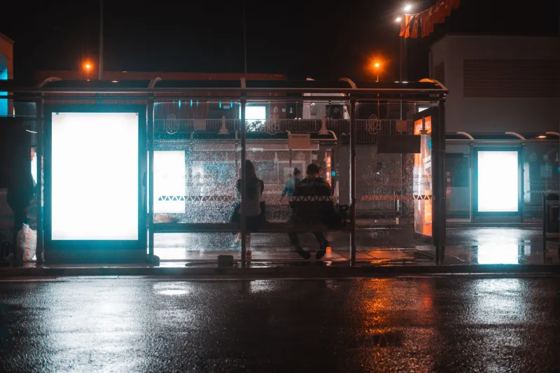
Picture a bus shelter on a wet Tuesday in Salford. The glass is steamed up, someone is eating chips, and a charity poster is doing its best between a council notice and an advert for a mobile network. The person standing there is not there to be convinced. They are there to get the 67. That is the real brief.
Most charity communications in UK public space are made for an audience that never agreed to listen. GP waiting-room screens, library noticeboards, community centre corridors, the side of a leisure centre. People meet your brand mid-errand, mid-worry, mid-conversation. They give you three seconds and a side-eye. Designing for that is not a lesser craft. It is the main event.
Borrowed attention is not the same as captive attention
A conference stage gives you a room. A direct mail pack gives you a kitchen table. A bus shelter gives you a pause. Everyone involved knows the difference except, sometimes, the campaign brief.
The temptation is to treat public space like a lecture hall. Put up the statistic. Add the sad eyes. Tell the passer-by that they can stop this, if only they care enough. But borrowed attention has terms and conditions. It is noisy, hurried, and easily offended. It is also democratic: the same poster is seen by the donor, the volunteer, the person who needs the service, and the person who has been misrepresented by a charity campaign before. All in one afternoon.
Good out-of-home work accepts that it is a guest. It does not shout down the host. It does not block the pavement. It says something useful, then gets out of the way.
Guilt is a cheap shortcut, and people can smell it
Guilt-based charity advertising still works just enough to survive, which is a problem. It gets a glance. It might get a donation. But it also teaches people that your organisation sees them as a wallet with a conscience, and it often trades on images of people who never got to choose how they were shown.
In a bus shelter, guilt has a very short shelf life. The viewer is not in a reflective mood. They are cold. They are checking the timetable. If the first thing your poster does is imply they are a bad person for not stopping to cry, they will look at the phone network advert instead. That is not apathy. It is self-defence.
A dignity-first approach is not soft. It is more precise. It asks: what can this person reasonably do in three seconds that is honest, useful, and not humiliating? Sometimes the answer is nothing beyond a small shift in understanding. That is allowed. Not every square metre of public space needs to produce a direct debit.
The bus stop test
Here is a simple check we use before a campaign goes anywhere near a shelter, screen, or noticeboard. It takes about ninety seconds. It saves months of quiet embarrassment.
- Would I be okay seeing this while eating a sandwich? If the answer is no, the tone is probably too much for the space.
- Can I read the main line from two metres away, in bad light, without my glasses? If not, it is not a poster yet. It is a paragraph with delusions.
- Does it ask for one clear next step that suits the location? A QR code at a bus stop in the rain is not a next step. It is a dare.
- Does the image and language let the people shown be more than their worst moment? If the answer is no, go back.
- Does it leave the space better than it found it? Not just aesthetically. Does it respect the host, the neighbours, and the person who has to stand next to it every day?
Five questions. No dashboard. No sixteen-slide deck. If a campaign fails three of them, it is not ready.
Make the action fit the pavement
The most common mistake in public-space charity comms is asking for something the setting cannot support. A bus shelter is not a donation form. A GP screen is not a petition. A library noticeboard is not a landing page.
Match the ask to the moment. In a community centre corridor, a poster for a Tuesday drop-in with a tear-off strip is good. In a library, a bookmark with one plain sentence and a shelf location is good. On a GP screen, a short film with captions and a memorable web address is better than a guilt montage with a QR code at the end.
If you must use a QR code, test it in the actual place. Test it with cold hands, on a cheap phone, on a slow connection. Test it with someone who has low vision or a learning disability. If it takes more than a few seconds, you have designed a labyrinth and called it engagement.
The words are part of the furniture
In public space, every word has to earn its place. That means fewer clauses, fewer abstractions, fewer phrases like "holistic support pathways" when you mean "help with food and bills". It means writing for the person who is already tired, not the person who is already on your mailing list.
Plain English is not dumbing down. It is hospitality. It says: I have thought about the fact that you are standing up, wearing a coat, and wondering if the bus is late. I am not going to make you work.
The same goes for names and labels. If your campaign is about people who use your service, ask them what they want to be called. Not in a focus group six months after the poster is printed. Before. This is where co-design stops being a workshop format and becomes a practical quality control.
A small brief for public space
Before you sign off the next shelter, screen, or noticeboard, write this at the top of the brief: this audience did not come here for us. Then design accordingly.
Give them one clear thought. Give them one realistic next step. Show people with agency, not just need. Respect the host space. And remember that a bus stop is not a conversion funnel. It is a small, shared room with no walls, where someone is trying to get home.
The best charity campaigns in public space do not demand attention. They borrow it politely, say something useful, and give it back.