Stop Apologising in the Window: Charity Retail and the Art of Looking Like You Belong on the High Street
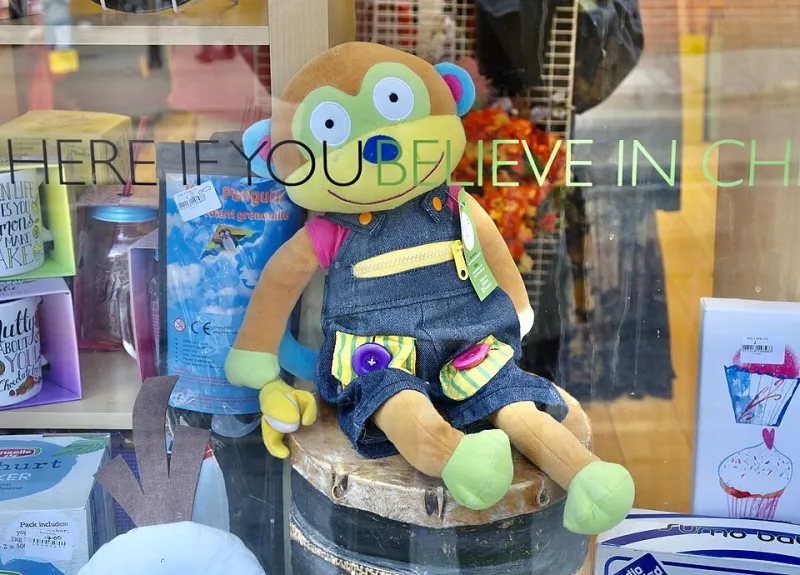
Photo: Anthony O'Neil , CC BY-SA 2.0, via Wikimedia Commons
Stand on the pavement opposite your charity shop at eleven o'clock on a Saturday morning and give it ten minutes. Watch how many people slow down. Watch how many actually look at the window rather than through it, and how many change direction once they've seen what's in it.
That's not a thought experiment. It's an interview. Your window is being read by dozens of people an hour, and unlike your website, your annual report or your Instagram, it doesn't get to explain itself. It gets one glance and whatever dignity it can hold at eye level.
A window is a brand interview you never booked
Most charities treat the shop front as a noticeboard with a shop attached. Somewhere to tape the poster about the winter appeal, the leaflet about volunteering, the opening hours, the request not to leave donations outside, and a photocopied thank-you from a local school. All of it worthy. None of it designed.
Meanwhile, the shop two doors down — the one selling candles and overpriced cushion covers — has spent actual money thinking about how its window makes you feel. And it works. Not because it's expensive, but because someone made a decision.
Purposeful design isn't a luxury for organisations with a design budget. A window is the cheapest media a UK charity owns. It's on a high street, it's open seven days, and it's talking whether you've briefed it or not.
What most windows are actually saying
Read your own window as a stranger would. Sun-bleached A4 in four typefaces. A5 handwritten in biro. Something blue-tacked at knee height. A pile of coats visible behind the glass in a heap on the floor. A sign that says NO BUGGIES in capitals, three times, in three places.
What that window says — regardless of your mission statement — is: this place is a bit chaotic, we don't quite trust you, and we're apologising for existing. Which is a shame, because the shop is probably lovely and the volunteers are almost certainly running it on goodwill and a broken steamer.
Dignity is a merchandising decision
Here's the bit that gets missed in every guide to charity retail. How you display donated goods is a statement about the people who donated them and the people who might buy them. There's a line, and you can feel it immediately when you cross it.
A handbag on a clean shelf, styled with a scarf: that's a good find.
A row of used toothbrushes, or shoes with the laces cut out, or a tableau of worn-out things arranged to look like hardship: that's turning need into spectacle. It invites people to feel sorry rather than to come in and buy something brilliant for a fiver.
So the rule is simple. Show what the money buys and what the donation becomes. Show the good coat, the good lamp, the good book. Don't stage a scene of scarcity. And never, ever put a service user's photograph in the window alongside a statistic, however well-meaning the campaign.
A system you can run on forty quid and two volunteers
You don't need a visual merchandiser. You need three decisions, made once, then repeated.
- Pick a palette and stick to it for a season. Two or three colours, plus paper. If the props are the same every month, the window stops looking accidental even when the stock inside it is a lucky dip.
- One focal point. One thing the eye lands on from three metres away. A dress on a stand, a lamp, a stack of books, a chair. Everything else is supporting cast.
- Three levels only. Eye level (roughly 1.5 metres — where adults look), front-of-window floor, and a single raised riser. Props made from boxes wrapped in paper are perfectly fine. Nobody is inspecting the boxes.
- Clean the glass on a Tuesday. Greasy glass is the single most common own goal. It makes everything behind it look tired.
- One light, working. A clip light or a cheap LED strip aimed at the focal point beats four dead bulbs and a hopeful arrangement.
- Maximum two pieces of print, same typeface, same size. One invitation, one piece of information. Not five.
That's it. That's the system. Two volunteers can run it, and the shop will start to look like somebody is in charge.
Make it sound like the street it's on
Charity shops cluster. In a lot of market towns the high street now has three of them within forty metres, and they compete for the same six bags of donations and the same eight regulars.
The ones that win the passing trade are the ones that look like they know where they are. Reference the town. Quote a local bakery or a local football team. Put the name of the street, not just the charity, on the glass. Let local schools and makers have a corner of the window for a fortnight. A shop that reads as part of the place gets supported like part of the place — and that's a co-design move, not a marketing one.
It also does the thing branding is actually for: it tells a passer-by who you are, who you're for, and what happens if they walk in.
The invitation, not the notice
The best charity shop windows have one job: make someone push the door. Which means the window needs an invitation in it. A price. A reason. A small, charming, human signal that the person inside will be glad you came in and won't interrogate you about Gift Aid before you've got through the doorway.
So here's the test before you tape anything up. Stand on the pavement. Look at your own window for ten seconds, which is roughly all you'll get. Can you tell what the shop is, who it's for, and whether you'd be welcome inside?
If you have to squint, apologise for the mess, or explain it, take it all down. Start again. The street is giving you a free interview every single day — it deserves a better answer than laminated A4.