The Paperwork Is the Welcome: Rethinking Governance Documents as Brand Work
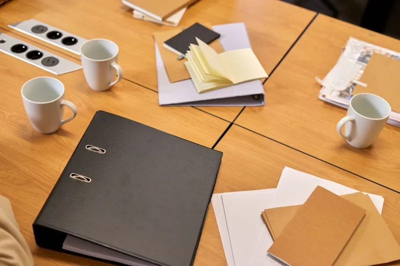
There is a particular kind of silence that fills a room when a new trustee opens their first board pack. It is not always bad silence. Sometimes it is concentration. Often, though, it is the quiet shock of realising that the organisation you admire from the outside has an inside that looks like a filing cabinet having a difficult day.
We spend a lot of time in the charity sector talking about brand as if it lives on the public-facing edge: the website, the appeal film, the logo on the van, the tone of the thank-you email. All of that matters. But brand is also what happens when nobody is performing for donors. It is the language used in a recruitment notice for trustees. It is the way a finance report explains a difficult decision. It is whether a board paper assumes you already know the acronyms, or takes two lines to welcome you in.
For small UK charities, this is not a side issue. Governance documents are one of the clearest signals of organisational culture. They tell people whether this is a place where questions are welcome, whether disagreement is safe, whether the board is a rubber stamp or a thinking space. They are brand artefacts, whether anyone designed them or not.
The board pack is a first impression, not an admin task
Think about who reads your governance papers. Yes, trustees. Also prospective trustees, co-opted members, advisers, maybe a funder doing due diligence, or a community partner trying to understand how you make decisions. For many of those people, the pack is not background reading. It is the first proper encounter with how you think.
And yet board papers are often assembled at the last minute from a template that has been passed down since before anyone currently involved joined. The cover page is a screenshot of a spreadsheet. The chair's introduction is three sentences of apology for the lateness of the papers. The risk register is in eight-point font. The whole thing says: we are busy, we are compliant, please do not ask us anything complicated.
That is a brand message. It is just not the one most charities would choose.
Governance tone is culture made visible
A useful exercise is to read your last board pack as if you were a stranger. Not a hostile stranger. A curious one. Someone who cares about the mission and wants to know whether they could contribute. What does the document tell them about how decisions get made? Who speaks? Whose expertise is assumed? What happens when something goes wrong?
If the answer is 'it depends who is in the room', that is worth noticing. Governance design is not about making everything blandly friendly. Boards need rigour, challenge, and clear records. But rigour does not require coldness. You can be precise and welcoming at the same time. In fact, the best governance documents usually are.
This is where brand strategy meets the unglamorous machinery of meetings. A charity that says it values lived experience externally should not have a board recruitment pack that reads like a legal disclaimer. A charity that talks about collaboration should not circulate papers that make it impossible to see where one issue ends and another begins. The gap between public story and internal practice is where trust gets worn thin.
A practical audit for small charities
You do not need a full rebrand to make governance documents feel more human. Start with a quiet review of one recent pack. Ask a few honest questions.
1. Does the cover do any work?
A cover page can be plain and still be thoughtful. It can name the meeting, the date, the purpose, and the person to contact with questions. It can include a short 'what we need from this meeting' box. It can use the same typeface as the rest of your organisation. None of this is decoration. It is orientation.
2. Is the language doing the reader a favour?
Read the first page aloud. If you stumble, a trustee will too. Replace unexplained acronyms. Break long sentences. Use headings that say what the section is for, not just what it is called. 'Finance update' is fine. 'Finance update: what has changed since last time and why it matters' is kinder.
3. Are decisions easy to find?
Board packs often bury the actual decision under background, appendices, and historical context. Put the ask near the top. Say clearly: 'The board is asked to approve...' or 'The board is asked to note...' or 'The board is asked to discuss and advise on...' This is not dumbing down. It is respect for people's time.
4. Is disagreement designed for?
A healthy board pack makes room for dissent. It might include a short 'questions we are still sitting with' section. It might flag where trustees are being asked to choose between imperfect options. It might name the trade-offs. This signals that challenge is part of the culture, not a failure of consensus.
5. Is it accessible in the practical sense?
Good governance is not just a tone question. It is also a formatting question. Clear headings. Readable font sizes. Alt text on images. Documents that can be read on a phone. Colour that does not carry meaning alone. A short summary at the top for anyone who needs the gist first. These are small design choices with a big cultural message: we expect you to be here, and we want you to be able to take part.
The quiet brand work nobody puts on the website
There is a temptation to treat this as housekeeping, something to fix once the important brand work is done. But governance documents are not outside the brand. They are where the brand goes to work. They shape who puts themselves forward for trustee roles, how confident people feel to speak in meetings, and whether the organisation's public values survive contact with its own paperwork.
For small UK charities, the opportunity is real. You do not need a design agency to redraw every template. You need a decision that the inside of the organisation deserves the same care as the outside. That might mean a one-page guide to reading a board pack. It might mean a trustee recruitment notice written in plain English, with a real person's name at the bottom. It might mean adding a line to every agenda: 'If anything here is unclear, ask. That is part of the job.'
Brand is not only what people see. It is what people experience when they are trusted with the keys. The paperwork is the welcome. Design it like you mean it.