Built for the Group Chat: Brand Assets That Survive Being Forwarded
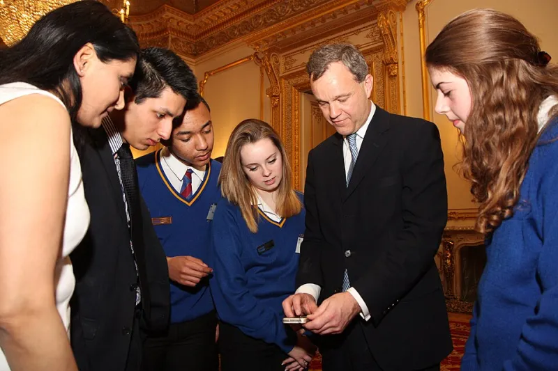
Photo: Foreign and Commonwealth Office, OGL v1.0, via Wikimedia Commons
Most small UK charities don’t get found through a beautifully built homepage. They get found because someone in a WhatsApp group forwards a screenshot, because a neighbour photographs a flyer on a noticeboard, or because a supporter shares your post with three words typed on top: ‘please help’. That is the real front door. And it is usually a bit blurred.
This isn’t a reason to despair. It’s a design brief. If your brand only works at full size, in colour, on a clean white background, then it isn’t finished. It’s a fair-weather identity. The test is whether it still reads when it’s been through the washing machine of everyday sharing.
The front door is a thumbnail
Think about the last charity message you actually opened. Was it an email newsletter? A carefully considered annual report? Or was it a photo of a poster in a community Facebook group, with someone’s thumb in the corner?
For most grassroots organisations, brand recognition happens in messy conditions: a 64-pixel avatar, a greyscale photocopy, a square crop that cuts off half the logo, a forwarded image with a stranger’s caption across the middle. None of that is disrespectful. It’s just what sharing looks like in 2026.
So the useful question isn’t ‘does this look good on our website?’ It’s ‘does this still look like us when someone else is holding the pen?’
Four checks before you call an asset done
A practical screenshot test doesn’t need expensive software. It needs honesty and a phone that isn’t the newest one in the office.
1. The thumbnail test
Shrink your logo or key image to the size of a group-chat avatar. Can you still tell what it is? If the answer is a squint and a guess, you need a simplified version: a monogram, a shorter wordmark, or a single strong shape. Keep the detailed version for the places that can carry it.
2. The greyscale test
Print your asset in black and white, or photocopy it. Colour is lovely, but it is not a strategy. If the identity disappears without its brand palette, the contrast is too weak. A strong one-colour version should be a required brand asset, not an afterthought.
3. The half-cropped test
Screens crop images into squares, circles and tall rectangles. Put your logo and key message through those crops. Is the important part still visible? Build in a generous safe zone around the mark, and avoid placing essential words near the edges. Assume someone will crop it badly. Design so that a bad crop is still usable.
4. The caption test
Someone will add text on top. It might be supportive, it might be clumsy, it might be a line you’d never write. Leave clear space where a caption can sit, and make sure your own text isn’t competing with it. If the only readable thing in the image is your logo, that’s fine. If the only readable thing is someone else’s caption, you’ve lost the plot.
Type and colour choices for compressed images
Compression is unkind to delicacy. Hairline fonts turn to grey mush. Low-contrast colour combinations vanish. Gradients become banded stripes. If you want an asset to survive a screenshot, choose sturdy type with a generous x-height and clear letter shapes. Avoid long strings of all-caps, especially at small sizes. Use fewer weights, not more.
For colour, pick one strong anchor and let it do the work. Dark text on a light background is usually safer than pale text on a pale background. Test contrast rather than trusting your monitor. If you’re sharing a quote or a statistic, set it large and short. A paragraph of small text in an image is not a message; it’s a texture.
And please: test on an older Android phone, not just the designer’s laptop. That’s where the real compression happens.
Write the consent-and-credits line once, then reuse it
Photos of real people are not stock assets. If someone can be identified, you need consent for public sharing, including the slightly unpredictable world of group chats and community pages. A short line helps everyone behave well without turning a volunteer into a legal department.
Something like this, kept with the image file or in the share kit:
Photo of [first name] by [photographer or organisation], shared with consent. Please keep the whole image and don’t add words that speak for them.
That line does three jobs. It credits the photographer or organisation, it records that consent was given, and it asks people not to crop out context or put words in someone’s mouth. If identifying someone is risky, use a first name only or no name at all. Dignity beats attribution.
What to hand a volunteer
Most volunteers don’t want a 40-page brand guidelines PDF. They want to help, quickly, on their phone. So give them a share kit: five to eight ready-made assets in square and portrait formats, a one-colour logo, a short caption they can copy, alt text for the main images, the consent-and-credits line, and a simple do-and-don’t list.
Name the files clearly. ‘Logo square dark.png’ is a gift. ‘Final_final_use this one.png’ is a cry for help. Put the kit somewhere downloadable, not attached to an email that will be lost by Thursday. Then ask a volunteer to try it. Watch where they get stuck. That’s your real usability test.
Design for the mess, not the moodboard
A brand that survives WhatsApp isn’t a compromised brand. It’s a resilient one. It accepts that people will crop, compress, screenshot and caption. It plans for that rather than pretending it won’t happen.
The nicest thing you can do for a supporter is make it easy for them to share you well. That means simple assets, clear consent, sturdy type and a little humility about the conditions your work will actually live in. The group chat is not the enemy of good design. It’s just the place where good design has to prove itself.