Two Logos, One Waiting Room: Branding a Charity Merger Without Erasing the People In It
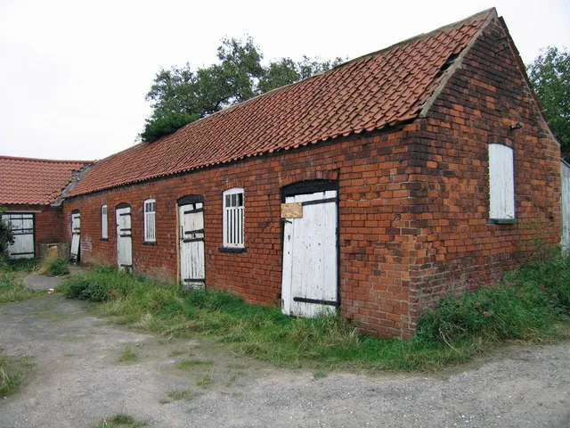
Photo: David Wright, CC BY-SA 2.0, via Wikimedia Commons
There is a moment in almost every charity merger when somebody says, "Right — we'd better sort the branding." It tends to land after the due diligence is signed, after the legal structure has been argued over in three separate meetings, and about a fortnight before a member of staff has to explain to four hundred service users that the Tuesday drop-in now has a different name, a different logo and a different person on the door.
That order is back to front. Brand isn't the ribbon tied round the merger at the end. It's the bit people actually touch — the sign above the door, the letter through the letterbox, the answerphone message that still says the old name six months after launch. If two UK charities are merging in 2026, the brand work starts the day trustees agree to explore it, not the day the lawyers go quiet.
Consolidation is now a small-charity story
For a few years the direction of travel has been pretty visible. Regulators and infrastructure bodies keep nudging trustees towards collaboration, consortia and, where it makes sense, merger. Rising premises costs, static grant programmes and the sheer exhaustion of chasing the same three funders as the organisation two postcodes over have pushed plenty of small charities into conversations they wouldn't have had a decade ago.
Merging isn't a failure. But the brand conversation around it is too often written by people who have never queued at the food bank, never signed in a volunteer on a wet Tuesday, and never had to explain to a funder why the name on the grant agreement doesn't match the name on the bank account.
Take a history before you take a decision
The first job isn't designing anything. It's auditing — and not the sort of audit that means reading two sets of brand guidelines and picking the nicer typeface.
Walk the building. Both of them. Look at what's actually on the walls. Read the letters that go out to supporters. Sit in the waiting room for twenty minutes and count how many times someone says the old name out loud, because that's the name that's real.
Make a list of every place a name appears: van livery, polo shirts, laminated signs, the letterhead on the minibus insurance, the QR code on the collection tin, the banner the volunteers drag out for the summer fête, the Google Business Profile nobody has ever claimed, and yes — the answerphone. It is always the answerphone.
Then do the listening. Ask service users what they call you, and what they'd worry about losing. Ask volunteers what they tell their mates they do on a Thursday. Ask referrers — the GP surgery, the school, the housing officer — how they'd describe you to a family in crisis. That's your evidence base, and it's worth more than any competitor analysis.
Keep, blend, retire
Most merger branding offers two verdicts: keep the name or kill it. There's a third, badly underused option — keep the name people actually use and change everything behind it.
A few patterns that tend to work:
- The place-name anchor. Keep the neighbourhood name, gain a broader descriptor. "Hilltop" becomes "Hilltop — part of [New Charity]". The street keeps its shorthand; the funder sees a grown-up organisation.
- The sub-brand. The new parent brand carries the governance and the fundraising; the local projects keep their own names and their own faces on the door.
- Retire the logo, keep the language. Plenty of charities have a visual identity nobody could describe and a phrase everyone uses. Keep the phrase.
Because here's the thing about dignity: a service user doesn't care about your wordmark. They care whether the person at the desk still knows their name, whether the form is shorter, and whether they have to tell their story again to a stranger in a new fleece.
Design the transition as a thing in itself
Every merger needs a transition period with its own assets, and it should be measured in months, not a weekend. Twelve to eighteen months of honest dual branding is not indecision. It's courtesy.
What that looks like in practice: a one-page "what's changed and what hasn't" for the front desk; a short script for reception staff so five people don't give five different answers; stickers or panels that update existing signage rather than scrapping it; a temporary email footer; and a joint letter from both chief executives that doesn't use the word "journey".
Sequence matters more than most people think. Staff and volunteers first, always — they're the ones fielding the questions at the school gate. Then service users, in person, in rooms, with tea. Then funders, with clean paperwork. Then the press release, which is honestly the least important document in the pile.
Three audiences, three different questions
Service users want to know: am I still welcome, will my worker still be here, do I have to start again? Volunteers want to know: do I still belong, and does my Tuesday still matter? Funders want to know: is this competent, is this value for money, and which of my reporting lines survive?
Those are three different design briefs. A reassuring letter to a service user and a reassurance pack for a grants officer should not look the same, because they aren't doing the same job.
The dull admin nobody budgets for
Name changes and mergers drag a paper trail behind them: consent from the Charity Commission where the governing document requires it, Companies House filings if you're incorporated, bank mandates, payroll, insurance, DBS records, utilities, the Royal Mail redirect, the signage lease you didn't know existed, and the funders' communications teams who need the correct legal name on the next agreement. None of it is glamorous. All of it is brand, because every one of those touchpoints is a place where somebody meets your name for the first time.
And please — don't launch a new identity in December. Nobody has the bandwidth, and the Christmas appeal will thank you for it.
The merge test
So here's a simple test to run before you sign off the new look. Can a service user, a volunteer and a funder each find themselves in it without being asked to become somebody else? If the answer is yes, you've designed a merger. If it's no, you've designed a rebrand and called it a merger, and the people who'll notice first are the ones who can least afford the disruption.
Purposeful design isn't about making the change look seamless. It's about making the change survivable — and then making it feel like it belonged to everyone from the start.