One Brand, Two Tongues: The Bilingual Audit Your Charity Actually Needs
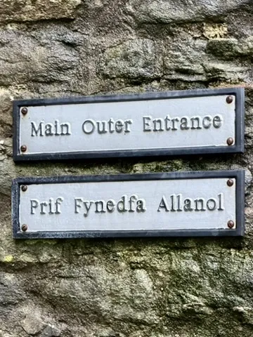
Photo: Sartma, CC BY 4.0, via Wikimedia Commons
There is a particular look to bilingual charity communications in the UK. English at the top, nice and bold. Welsh underneath, smaller, lighter, sometimes squeezed into a box that was clearly not designed for it. Or the reverse, with English bolted on as a courtesy. Either way, the message is quiet but clear: one language is the real one, the other is an accessory.
That is not a translation problem. It is a brand problem. And it is worth fixing, not because a funder might ask about it, but because the people you serve can feel the difference between a brand that includes them and a brand that tolerates them.
Translation is the last mile, not the first step
Most small organisations approach bilingual work like this: write the English, send it for translation, drop the Welsh into the layout, hope for the best. It is a sensible production line. It is also why so much bilingual material feels like two documents sharing a page.
Equal weight starts earlier. Before anyone opens a translation memory, ask what your brand sounds like in both languages. Not just the words — the rhythm, the warmth, the level of formality. Welsh and English often carry different registers. A phrase that sounds friendly in English can sound flippant in Welsh, or vice versa. Community languages bring their own conventions around respect, directness and formality. If your tone of voice document only describes English, you do not have a bilingual brand. You have an English brand with a translation habit.
The hierarchy test: who gets the big type?
Here is a simple audit you can run on any existing poster, leaflet or web page. Squint at it. Which language do you see first? If the answer is always English, ask why. Sometimes there is a good reason — legal requirements, audience data, a genuinely English-first context. Often there is not. It is just habit.
Equal weight does not mean every page must be 50/50. It means the hierarchy is a deliberate decision, not an accident of default settings. On a Welsh-language service poster in Gwynedd, Welsh should lead. On a national campaign aimed at mixed audiences, you might use parallel columns, or alternate the lead language across a series. What matters is that neither language is permanently demoted to the smaller, greyer, thinner line.
Typography is not neutral
Welsh uses diacritics — ŵ, ŷ, ô — and if your brand font handles them badly, you have a design problem and an accessibility problem. The same goes for Arabic script, Urdu, Polish diacritics, Somali orthography. A typeface that looks lovely in English might collapse into a mess the moment it meets a language it was not tested on.
So test it. Set a real paragraph in Welsh and in the community languages your audience uses. Check line length, line height and punctuation. Check how the brand's headline style behaves when words are longer or when the script runs right to left. You do not need a huge type system. You need one that has been stress-tested outside English.
And please, stop setting bilingual text in two different point sizes just because one language takes up more room. Find a layout that gives both language versions equal visual status. If that means fewer words in each language, good. Editing is a brand skill.
One voice, two registers
Tone of voice is where bilingual brands often quietly fall apart. The English might be warm and conversational. The Welsh might be formal and stiff because the translator was given no tone brief. Or the English might be cautious and precise while the Welsh sounds oddly breezy. Both are forms of inconsistency, and supporters notice.
Write a short bilingual tone guide. Not a 40-page manual. A page with three or four principles and a couple of examples in each language. Include the phrases you use often — greetings, calls to action, thank-yous, apologies. Decide whether you use 'chi' or 'ti' in Welsh, and be consistent. Decide how you address people in community languages where formality matters. This is brand strategy, not linguistics. It is about making sure the personality survives the journey between languages.
Imagery and accessibility belong in the same conversation
Bilingual design is also about who appears in the photographs, whose names are in the case studies, and whether the alt text exists in both languages. A brand that shows one community and speaks to another is not bilingual; it is just translated.
Accessibility matters here too. Screen readers need language tags. PDFs need proper reading order. Subtitles and British Sign Language interpretation are part of the same inclusive design conversation. None of this is glamorous. All of it is brand behaviour.
A realistic audit for small teams
You do not need a big consultancy budget to check whether your bilingual brand feels like one voice or two. Try this:
- Lay out five recent materials. Mark which language leads in each. Is the pattern intentional?
- Compare headline sizes, weights and colours across languages. Are they equal in status, even if not identical?
- Set a paragraph in each language in your brand font. Check diacritics, line length and readability.
- Read your tone of voice guide. Does it mention more than one language? If not, add a page.
- Ask three bilingual supporters which version feels more 'for them'. Listen without defending.
- Check your website's language switcher. Is it obvious, dignified and easy to use?
- Look at your photos and case studies. Who is visible, and who is only spoken about?
The point is not perfection
No small charity gets this completely right. The point is to stop treating bilingual design as a compliance chore and start treating it as a brand decision. Equal weight is not about word counts. It is about respect made visible.
When a Welsh speaker sees their language given the same care, the same typography and the same tone as English, they learn something about how your organisation sees them. When a community language is designed in rather than tacked on, the same thing happens. That is not a subtitle. That is the brand doing its job.