The Warm Bit After the Click: Designing Charity Thank-Yous That Feel Human
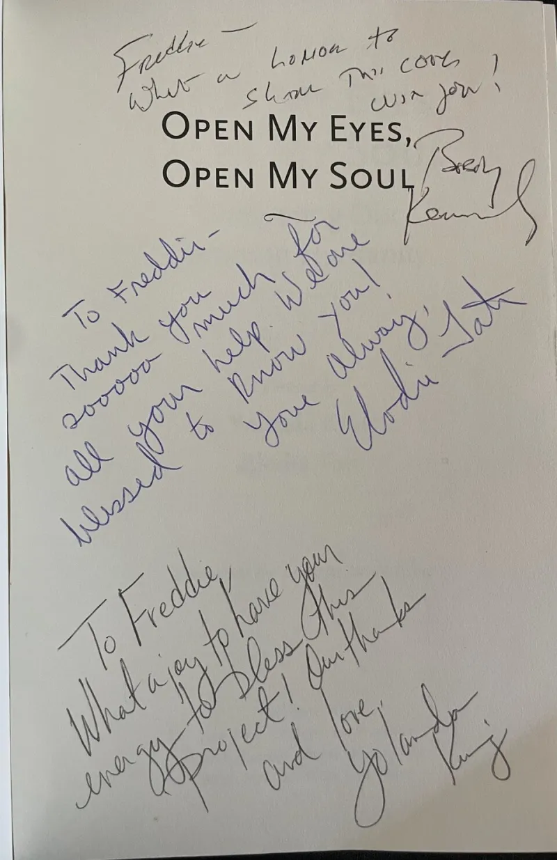
Photo: SaludyAmor, CC BY-SA 4.0, via Wikimedia Commons
Charities spend months on an appeal. The photograph gets tested, the headline gets argued over, the ask gets rewritten six times. Then the donation lands, and the thank-you goes out as a system message with a logo stapled to it. Not always, but often enough that it has become a sector habit.
That is a design problem, not just an admin problem. A receipt confirms a transaction. A thank-you does something different: it recognises a choice. Someone decided your work was worth their money, their time or their attention. The least we can do is write back like we noticed.
Start with the envelope, not the logo
A thank-you letter is a piece of brand design whether you treat it as one or not. The paper, the envelope, the typeface, the signature, the return address, the way the first line sits on the page — all of it tells the donor something about who you are. If your appeal was warm, local and human, and your thank-you looks like a parking fine, you have created a gap the donor can feel.
This does not mean expensive stationery. It means coherence. A small UK charity can use recycled paper, a clear layout and a real signature and still feel more considered than a national brand posting out glossy direct mail. The test is simple: would you be pleased to receive this? Would you pin it to the fridge, or would you file it with the council tax?
Specific beats gushing
The language traps in thank-you letters are well worn. 'We are so incredibly humbled.' 'Your generous gift will make a real difference.' 'You have impacted the lives of vulnerable beneficiaries.' None of these sentences are untrue. They are just too vague to land.
Specificity is the kindest form of gratitude. If someone gave £25 to your community fridge, tell them what £25 does this month: a week of fresh produce for three households, or the fuel for a collection run. If they volunteered for two hours at a repair café, name the thing they fixed or the person they welcomed. If they set up a regular gift, say what that reliability makes possible — the staff hours, the rent, the boring but essential stuff.
Avoid language that turns people into categories. 'Beneficiaries', 'service users' and 'the vulnerable' are useful in a funding bid and awful in a thank-you. Use plain words: people, neighbours, families, members, participants. And be careful with 'little' and 'brave' and 'deserving'. They sound warm and often read as patronising. A donor does not need to be told that the people you support are worthy. They already think so. They gave you money.
Personalisation when you are a team of four
You do not need a CRM the size of a small country to personalise gratitude. At low volume, personalisation is mostly attention. A handwritten first line. A named staff member. A local reference that could only come from your organisation: the Tuesday group, the allotment, the school down the road. A thank-you that mentions the appeal the donor actually responded to, not the one you ran in March.
If you are using mail merge, check it properly. A wrong name or a stray 'Dear [First Name]' undoes more goodwill than a generic letter ever would. Segment gently: one-off donors, regular givers, volunteers, local businesses, people who gave in memory of someone. Each group needs a slightly different tone, not a completely different brand.
And please keep the receipt separate from the thank-you. Gift Aid declarations and transactional details are important, but they should not be the first thing a donor sees. Acknowledge the gift in human language, then provide the paperwork clearly below or on a separate sheet. Gratitude first, admin second.
Accessibility is part of warmth
A thank-you that cannot be read is not a thank-you. Use a decent type size — 12 to 14 point for print, larger for older audiences — and strong contrast. Keep paragraphs short. Avoid pale grey text on cream paper because it looks tasteful in the studio and disappears in a kitchen. If you send email thank-yous, make sure they work with screen readers and do not put essential words inside an image.
Offer an easy-read version or a large-print version on request. Say so in the letter. It is a small line that signals you have thought about disabled donors as donors, not as an afterthought. And if someone has told you their communication preference, use it. A phone call, a text, a Braille letter or a plain text email can all be the right thank-you. The channel is part of the message.
Do not make them do admin to feel thanked
One of the quietest ways to patronise a donor is to turn gratitude into a funnel. 'Thank you so much — now please complete this survey, follow us here, upgrade your gift and share this post.' It is understandable. Small charities are always trying to do more with less. But the thank-you letter is not the place for the next ask. Let the gratitude breathe.
If you want feedback, ask separately and explain why. If you want donors to become regular givers, build a different piece of communication for that. The thank-you should do one job well: make the person feel that their gift was seen, understood and properly used.
A small test before it goes out
Read the letter aloud. Does it sound like a person? Would you say it to someone standing in front of you? Is there one specific detail that proves you know what they gave and why it matters? Is the receipt clearly separate? Could someone with low vision read it comfortably? Have you avoided every mention of 'beneficiaries'?
If the answer is yes, you are probably close. Gratitude is not a soft add-on to brand strategy. It is where your values stop being a poster and become a habit. The warm bit after the click deserves the same design thinking as the click itself.