Your Charity Van Is Already Talking: A Livery Audit for the Road
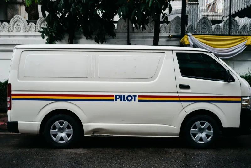
Charity vans are odd brand assets. A website waits to be visited. A van turns up. It idles outside a school in Leeds, squeezes down a B-road in Devon, parks badly near a hospital entrance, and sits in traffic on a high street in Bolton. Long before anyone reads your annual report, they have seen your logo on wheels — and formed an opinion about whether you look organised, friendly, trustworthy or slightly chaotic.
That is a design job. Not a glamorous one, perhaps, but a purposeful one. Vehicle livery is often treated as the last item on the list: a quick vinyl logo, a phone number, maybe a slogan chosen in a hurry. But a van is a moving poster that reaches places a website never will. It deserves a proper look.
Start by watching it leave
A useful audit begins in the car park, not in a brand workshop. Stand across the road and watch the vehicle pull away. You have about three seconds before it is out of sight. In that time, can you tell who it is and what it does? Not your full mission statement. Just the essentials: name, purpose, a way to get in touch.
Try it at 20mph. Try it in the rain. Try it with a bus shelter partly in the way. If the only legible thing is the registered charity number, the design is working for the regulator, not the public.
The three-second test
Ask six blunt questions of every side of the vehicle:
- Is the organisation name readable from a pavement?
- Does the vehicle say what you do, or only who you are?
- Is there one clear contact route — a phone number, a short URL, a QR code that is not waving about at speed?
- Does the tone match the rest of your brand, or is this a separate personality with a diesel engine?
- Would a passenger feel proud to be seen in it?
- Have you covered anything that keeps people safe?
That last one matters more than the first five. More on it below.
Budget livery without the shrug
You do not need a full wrap. For many small UK charities, a full wrap is the wrong spend. A single-colour cut-vinyl mark on the front doors and rear panel, set in a typeface people can actually read, will do more than a busy design stretched across every inch of paintwork.
Spend where people look. The rear panel gets attention in traffic and at delivery bays. The side panels work when the van is parked. A cheap magnetic sign that slides down the door on the motorway is not a brand asset; it is a hazard with a logo on it.
Use a signwriter or vehicle graphics specialist who understands curved panels and weather. Ask what happens when a panel is replaced after a scrape. Ask how the vinyl behaves after six winters. A modest, well-fitted job will outlast a cheaper, fussier one.
And resist the urge to fill silence. One clear mark, one plain-English line about what you do, one contact route. That is a strong livery. Everything else is decoration arguing with itself.
Safety is not a brand compromise
Livery must never obscure windows, lights, number plates, reflectors or manufacturer safety markings. Dark logos on dark vans disappear at dusk. Pale type on a white panel can vanish in low sun. Contrast is not a stylistic preference; it is an accessibility issue and, on a moving vehicle, a safety one.
If you run a minibus or community transport, look at the bits people touch and use: step edges, grab handles, door frames. High-visibility markings should not be sacrificed to the brand palette. A charity that paints over a reflective chevron because it clashes with the logo has designed for the boardroom, not the passenger.
Check your insurer's requirements, too. Some policies expect notification of signage or wraps. It is a dull paragraph in a policy document, but so is most useful safety work.
Dignity on the move
A vehicle carrying people is not a billboard first. It is a room that happens to move. That changes the design brief.
Avoid imagery that turns passengers into poster children for hardship. Avoid slogans that announce a sensitive service to the whole street — especially for domestic abuse support, mental health services or food aid. Sometimes discreet identification is the kinder brand choice. A small logo and a phone number can say enough.
Think about where the van parks. Outside someone's home? At a school gate? In a hospital drop-off? The brand is not only the vinyl; it is the driver's behaviour, the engine idling, the way the vehicle is cleaned. All of that is design in the broad sense: choices that shape how people feel in your presence.
A small audit you can do today
Photograph every side of the vehicle in daylight and in gloom. Print the photos. Show them to three people who do not work for you and ask what the organisation does. Listen without correcting them.
Then check: Is the name readable at ten metres? Is the phone number correct? Does the design still work if one panel is damaged? Are safety markings visible? Is there a consistent rule for future vehicles so the next hire car or donated van does not become a moving jumble sale?
Write those rules down in your brand guidelines. One page is enough. A van is a moving poster, but it is also a handover object. The question is whether it carries your brand with care when you are not standing next to it.